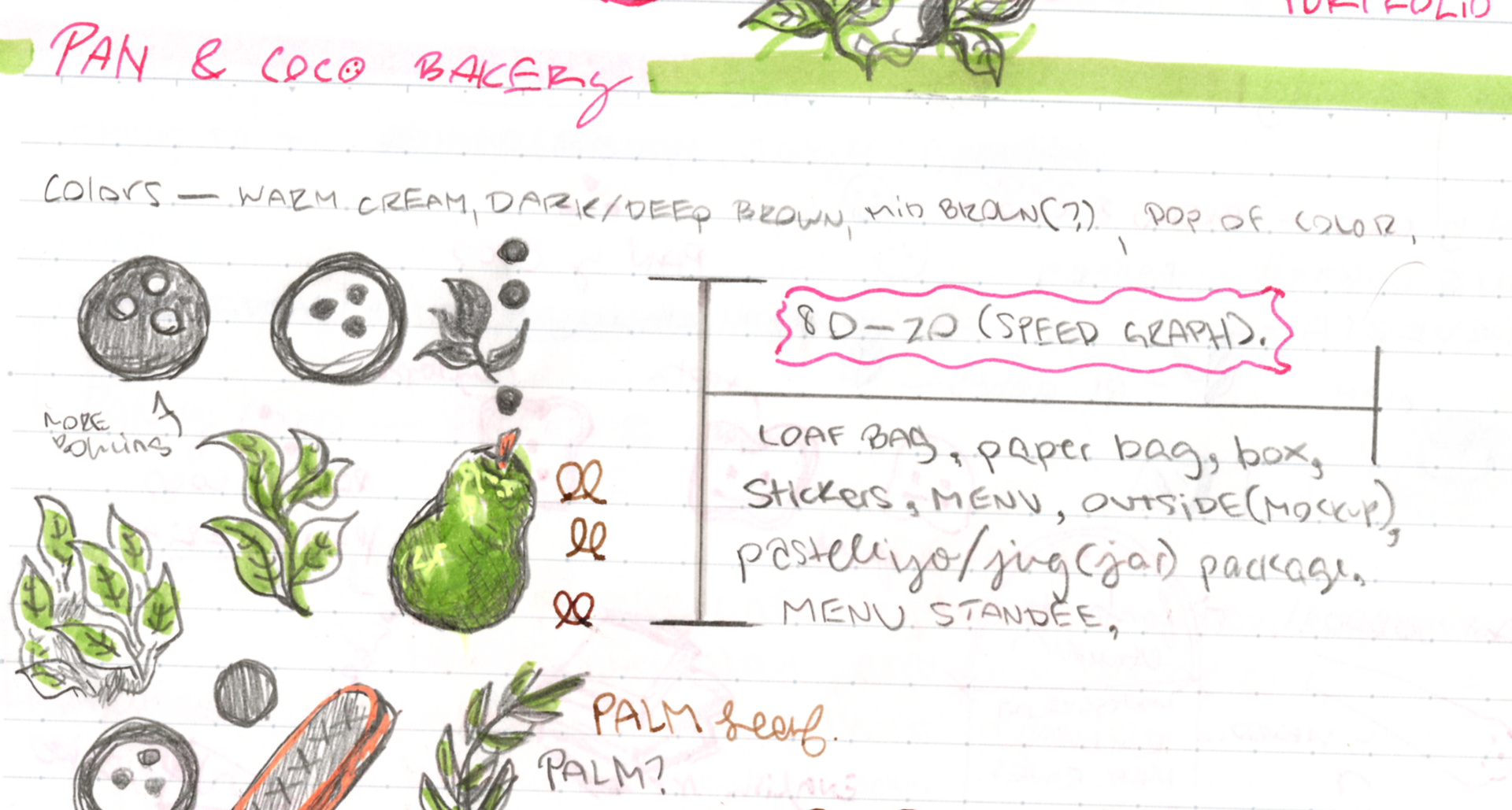
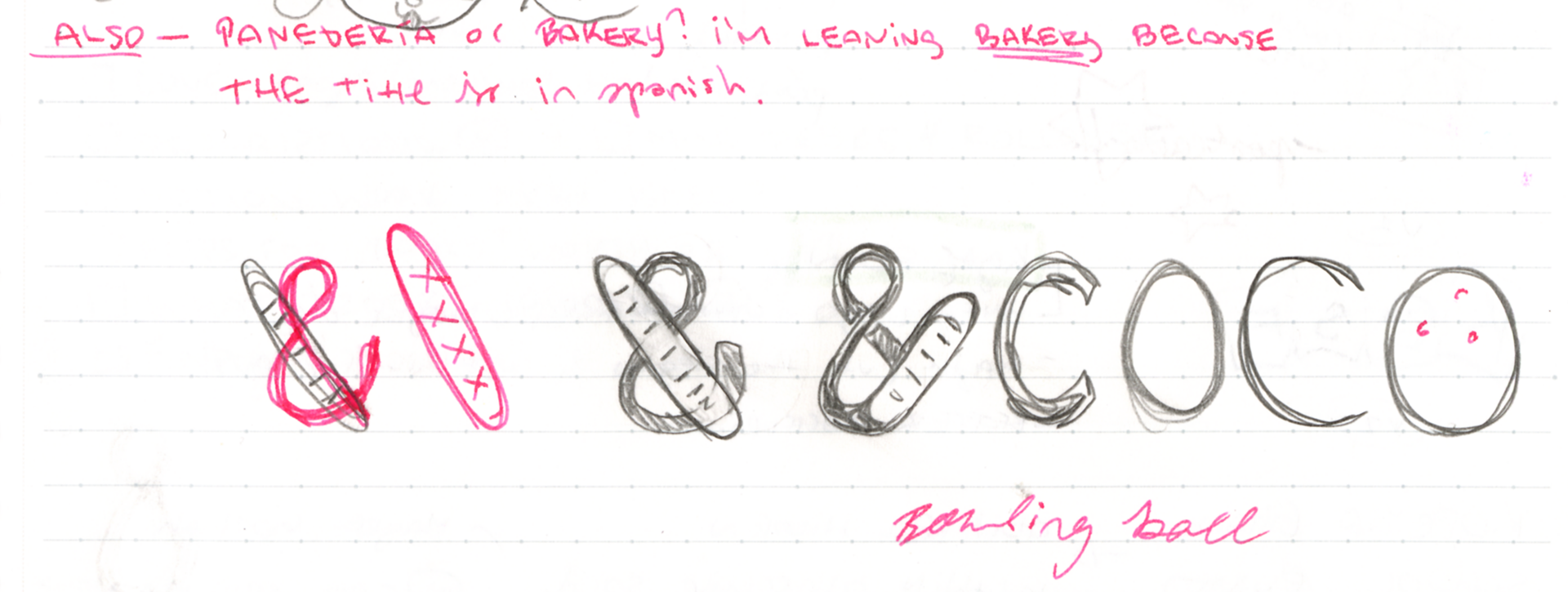
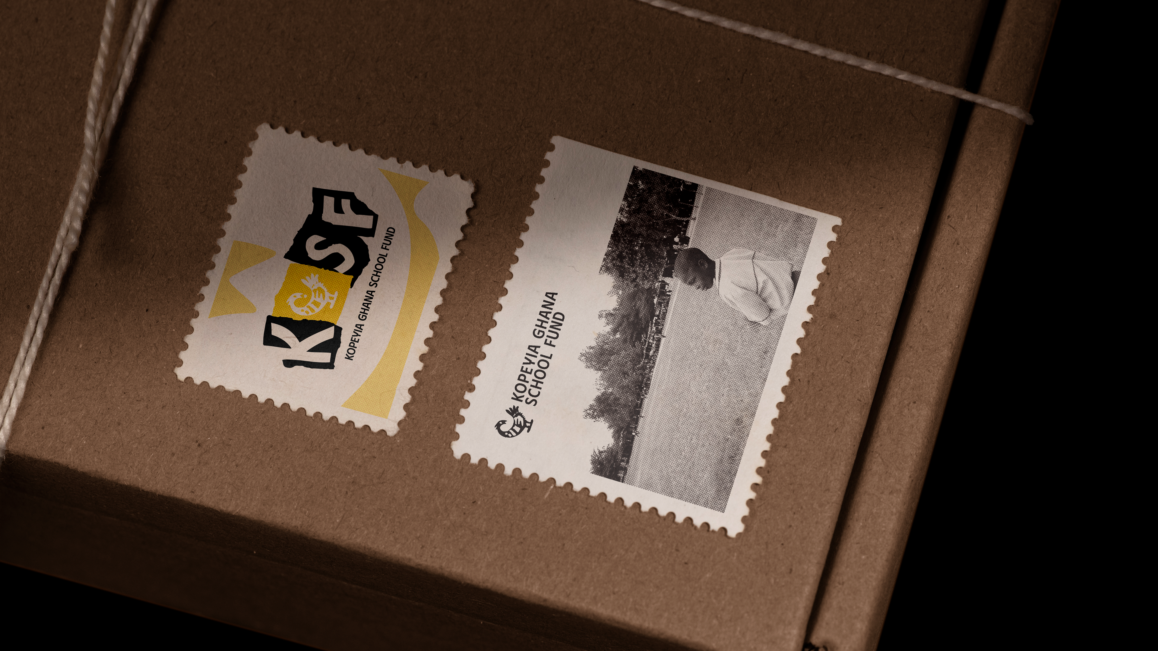
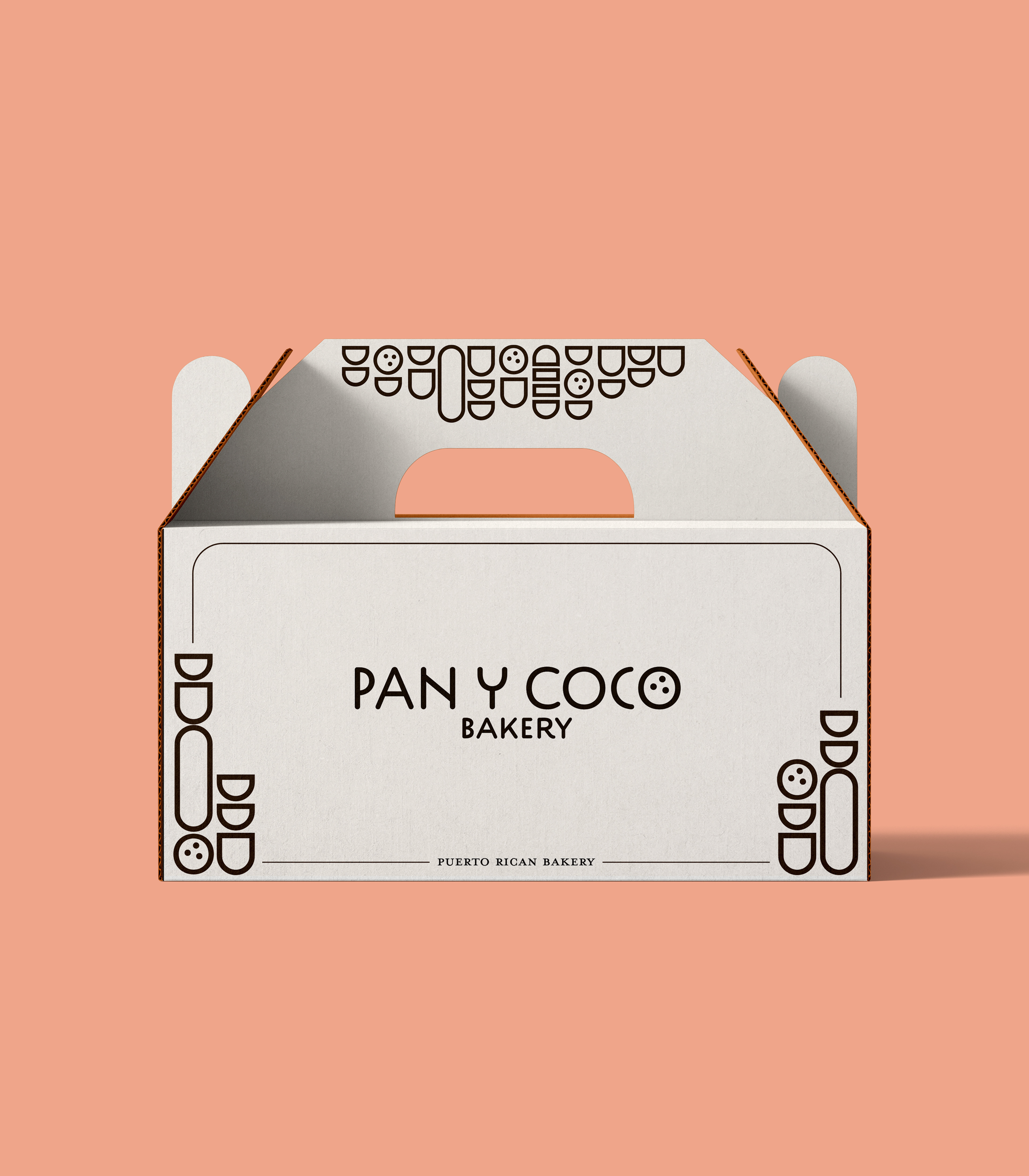
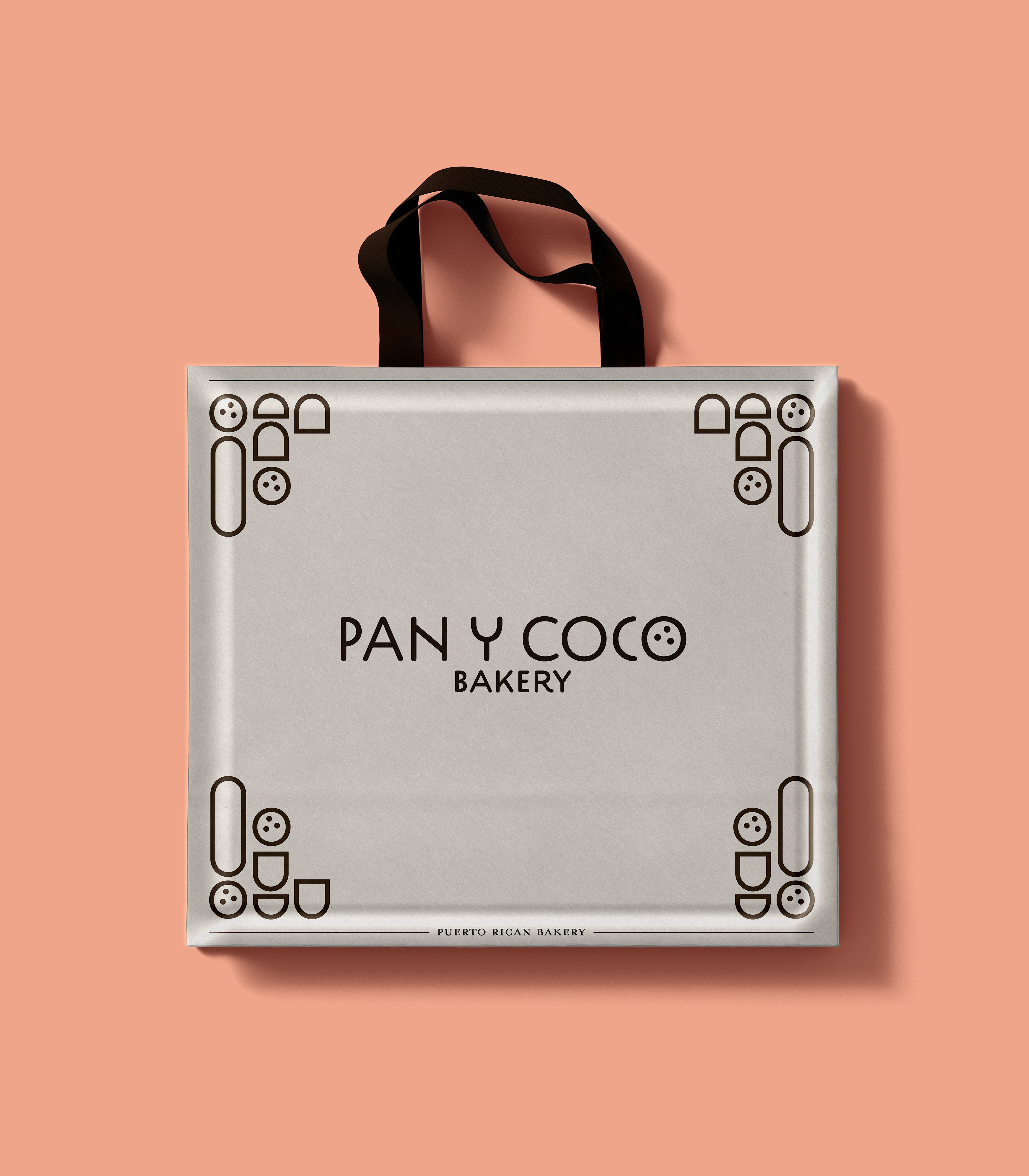
PAN Y COCO is a branding project concerning a Puerto Rican bakery. This is more of a passion project as it gives me an opportunity to reference my culture's treats. Pan y coco translates to bread and coconut, which are staples in Puerto Rican cuisine. The oblong shapes next to the coconuts are a simple way of representing bread. I originally designed something more detailed, but shifting to this approach gave me much more room to play with the visuals.
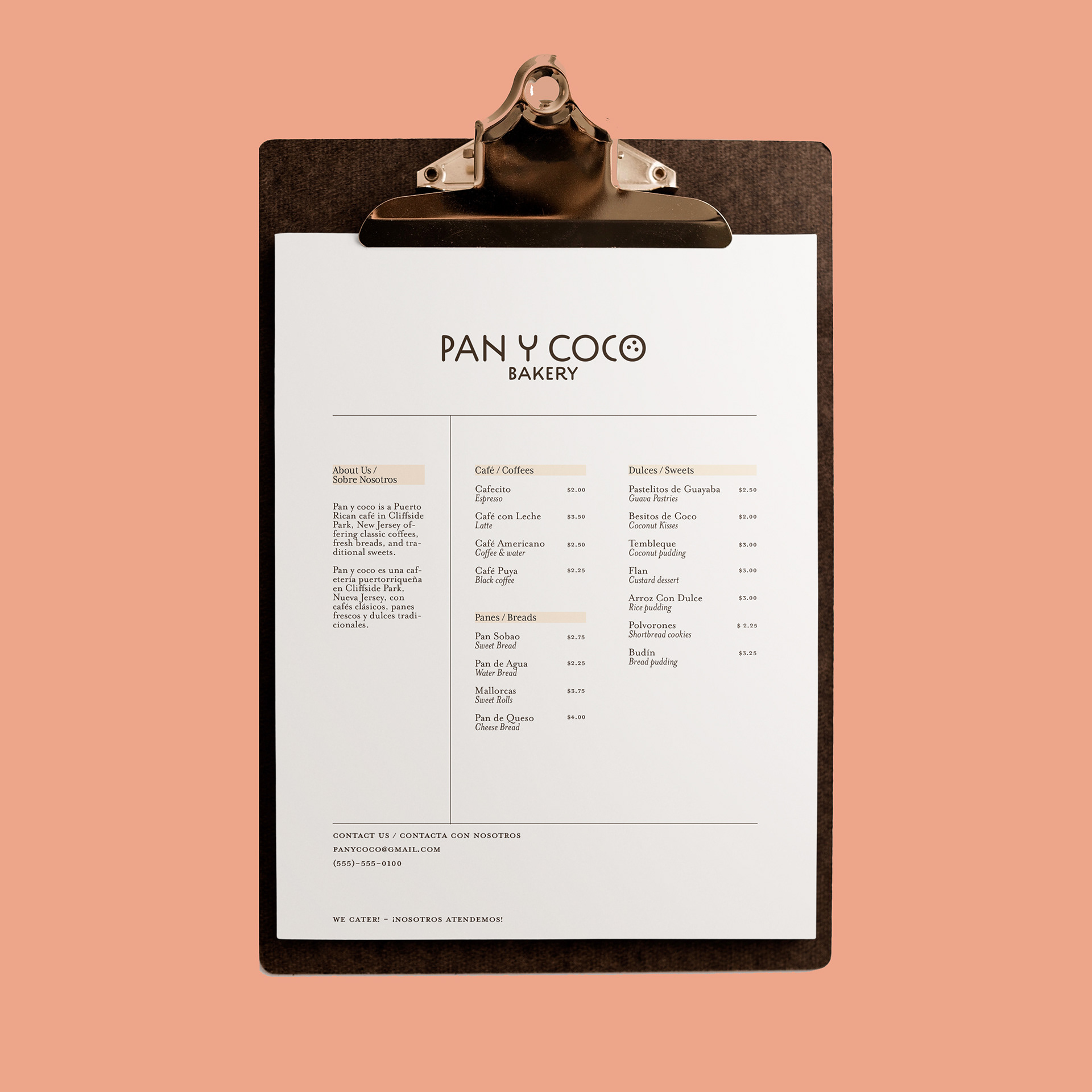

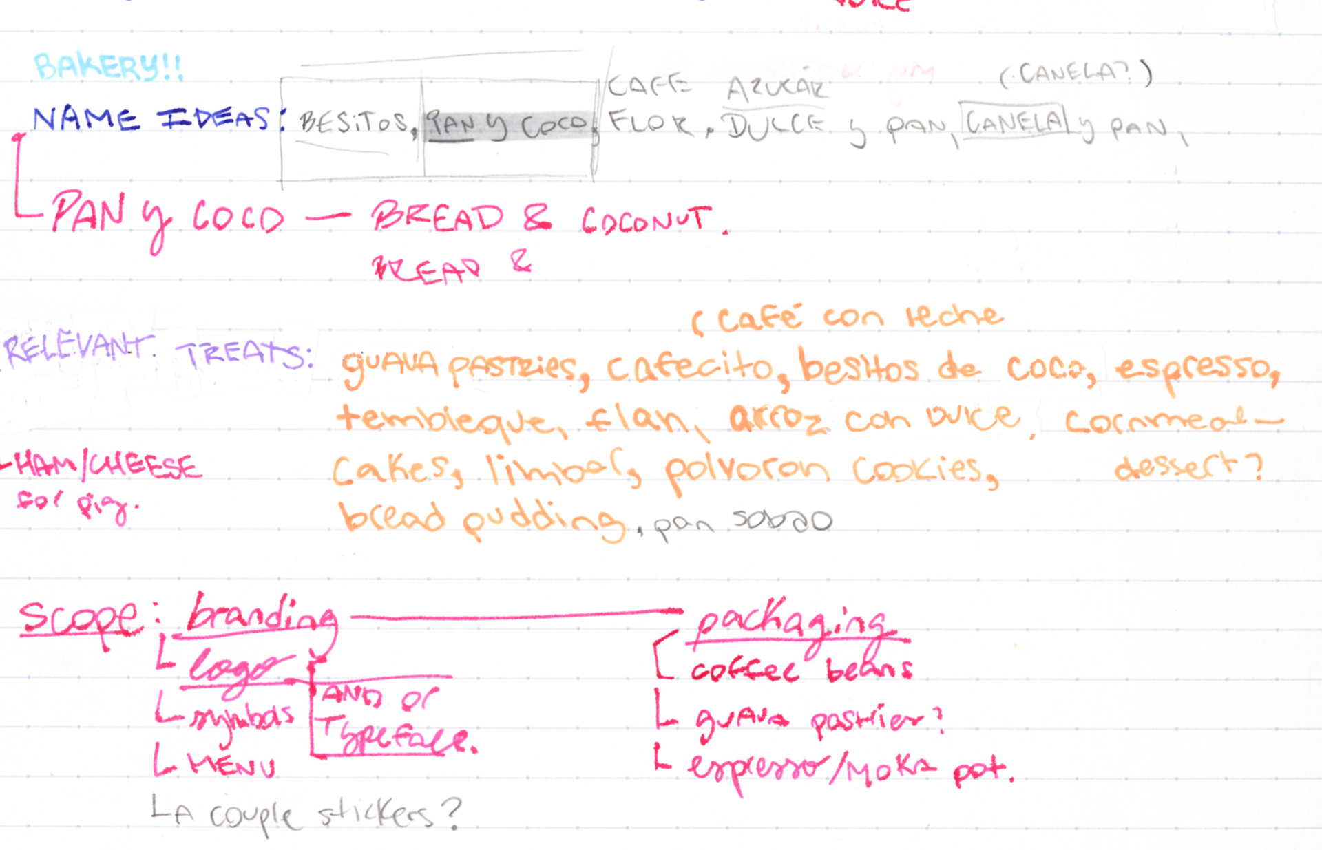
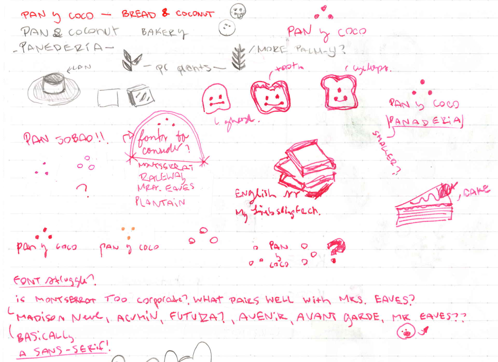
Below are some of the original sketches from this concept. I started this project by creating a list of my favorite Puerto Rican sweets. You can see my initial name ideations as well as deciding the scope of the project. I also tried a couple of different logos out, but eventually decided on the coconut as the main logo mark.
