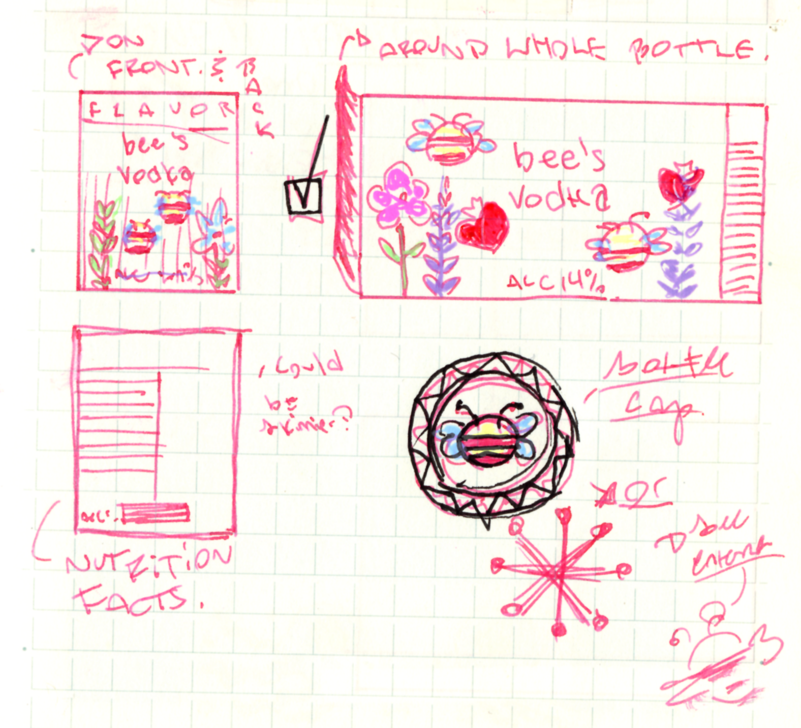
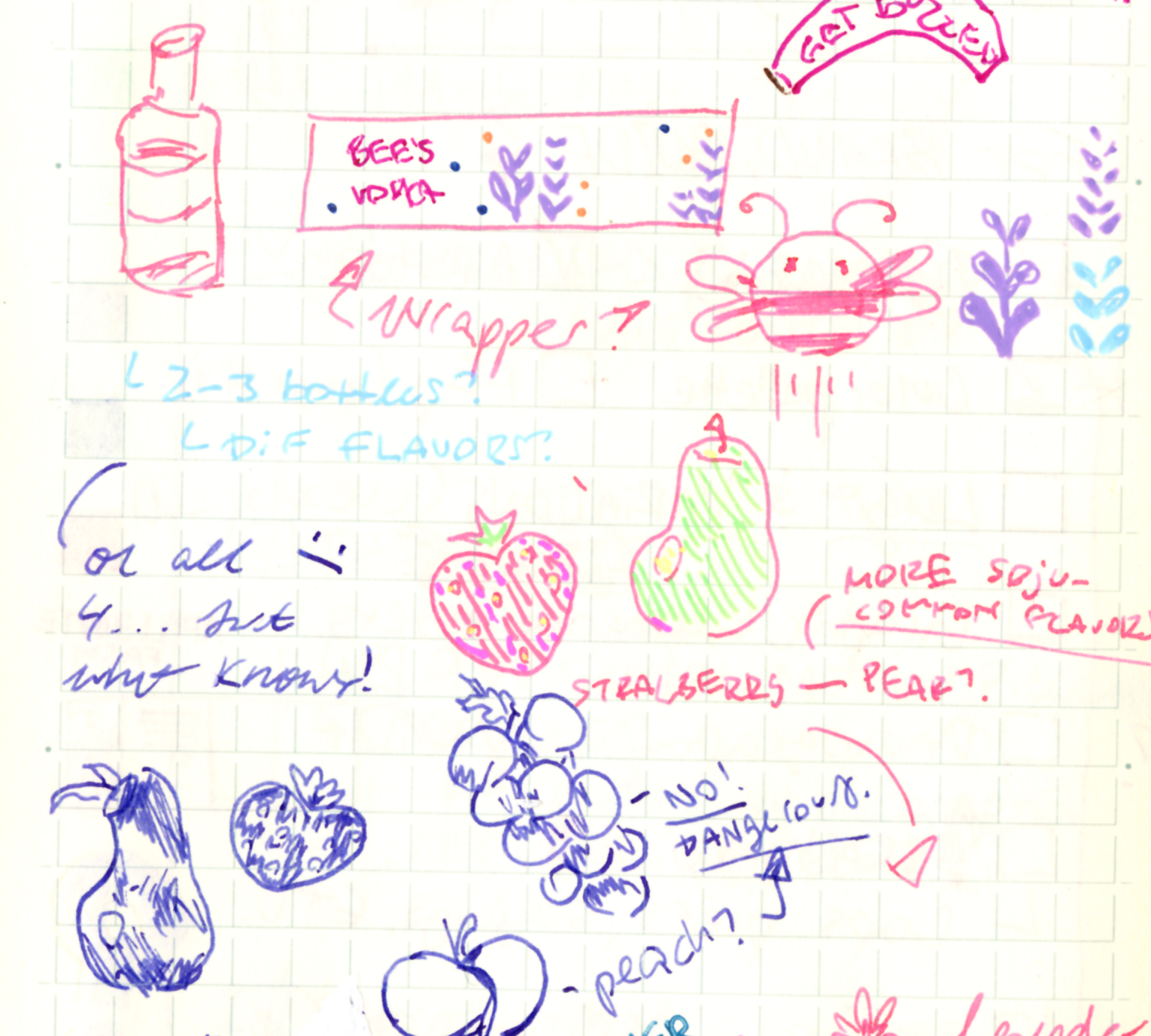
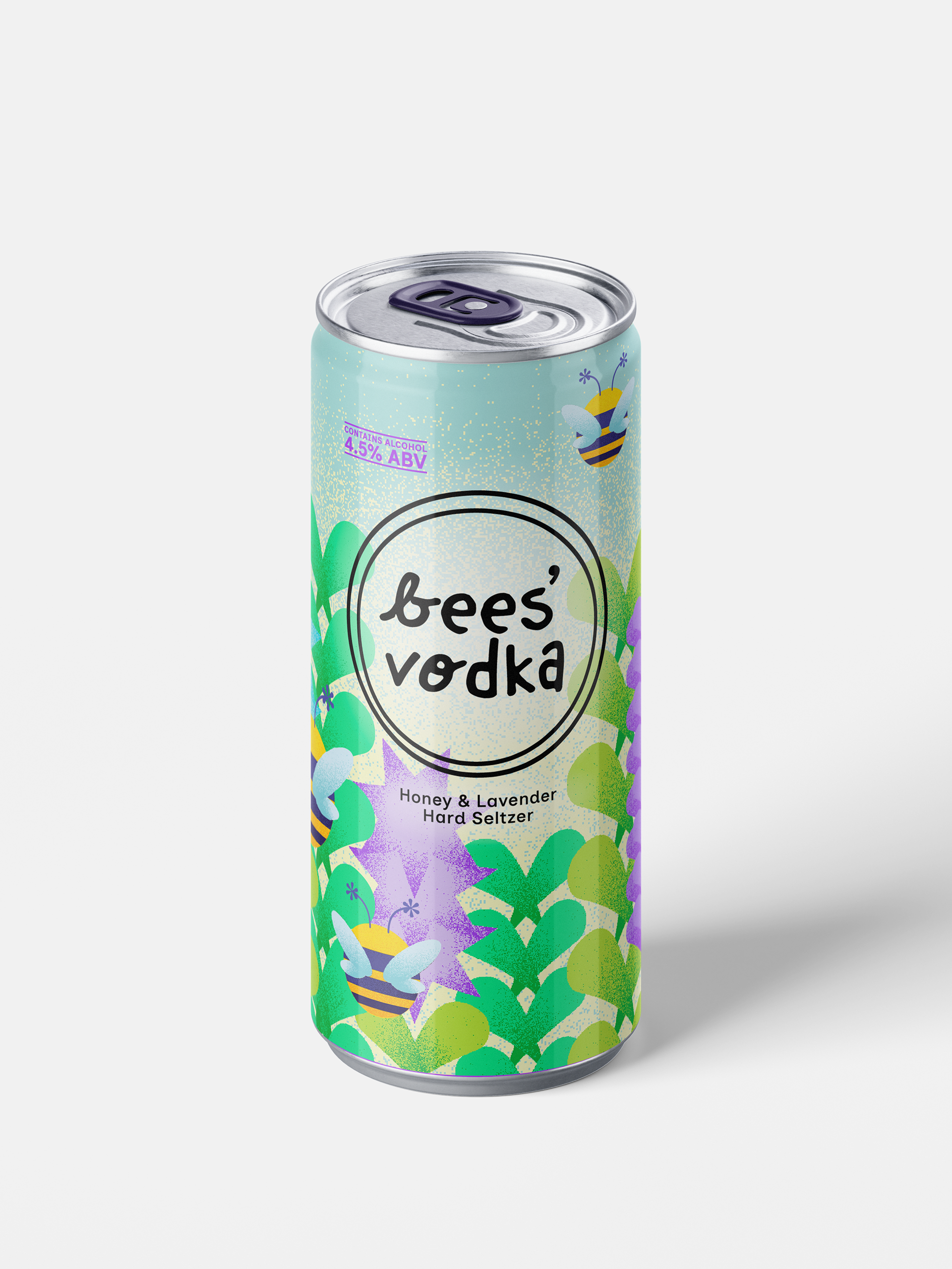
bees’ vodka is a packaging project that initially began in my motion design class. We were tasked with creating an advertisement for a fictional company, where I decided to design a vodka seltzer. I wanted to incorporate a lot of vector-illustrations, so I thought that a floral, summery look would benefit that. To keep everything consistent, I gave the illustrations a warm, stippled texture that ties the whole look together.
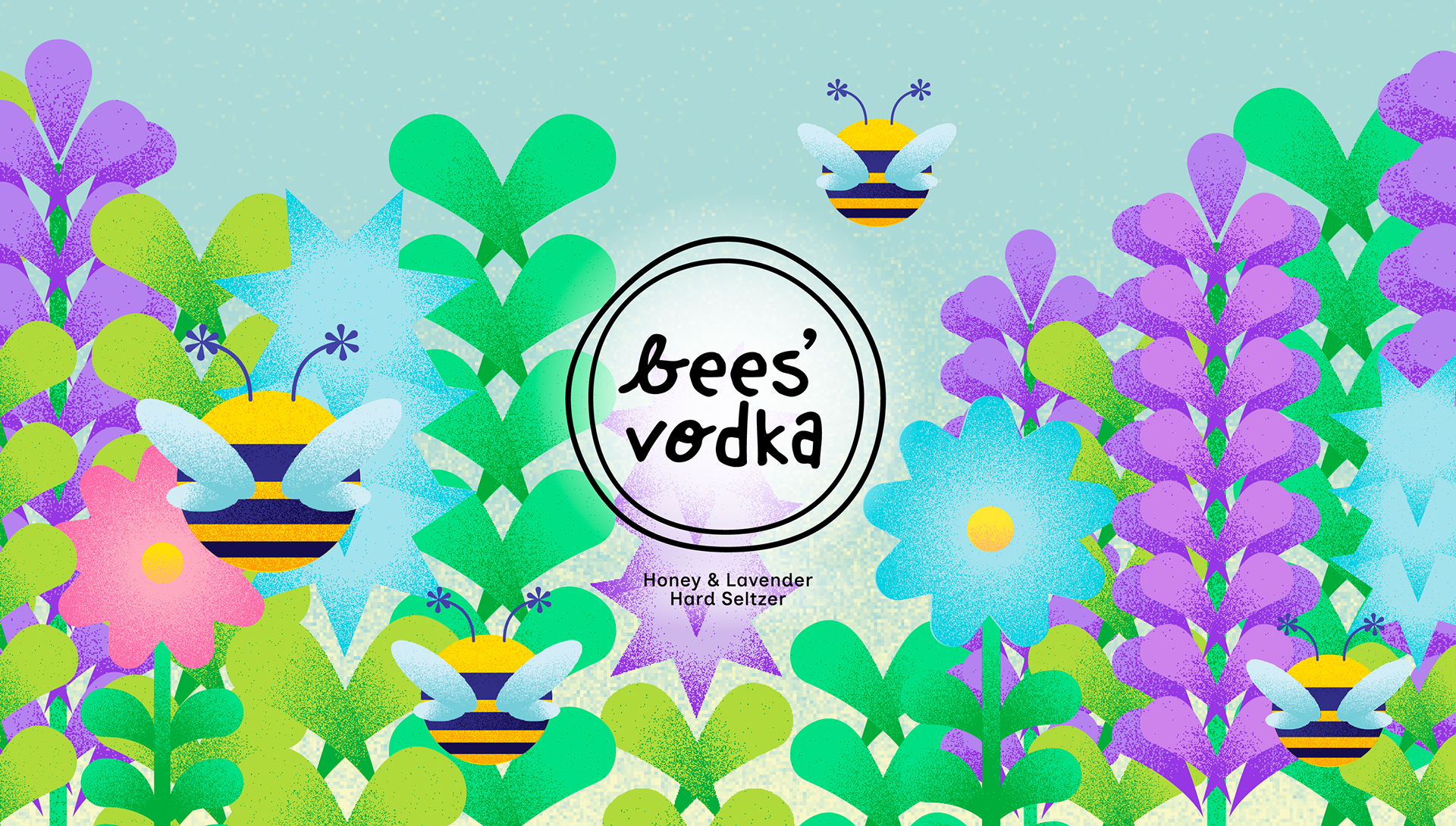
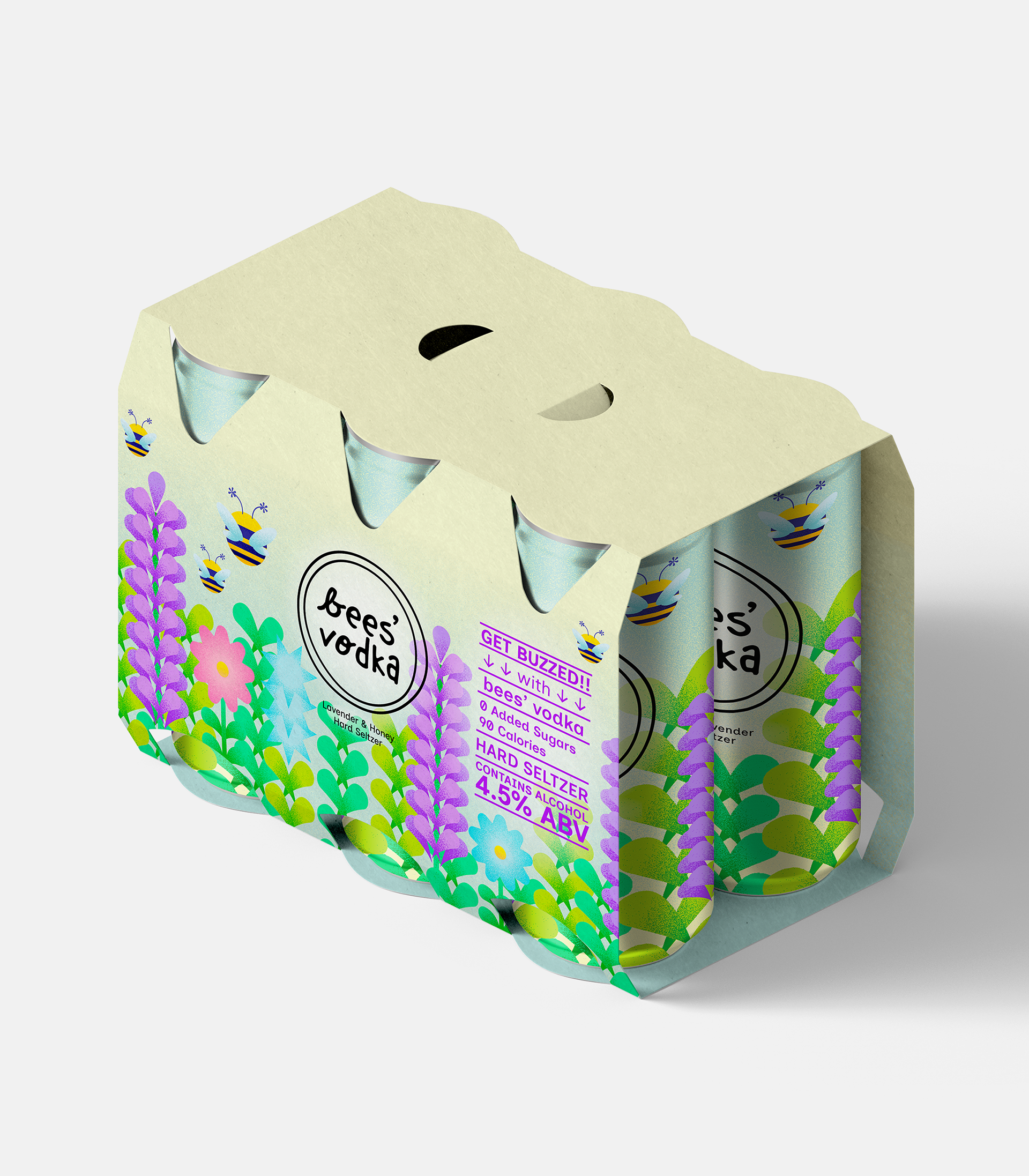
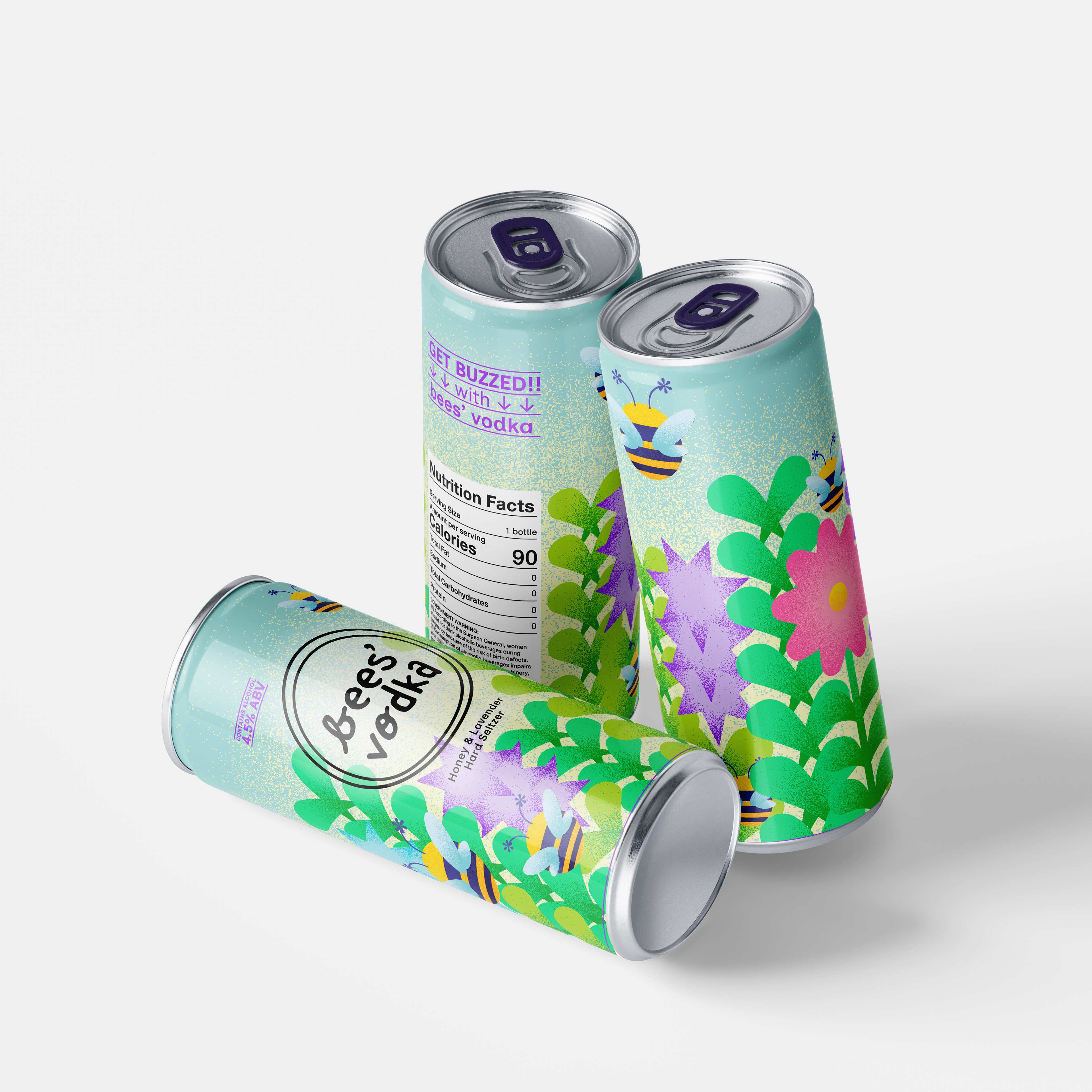
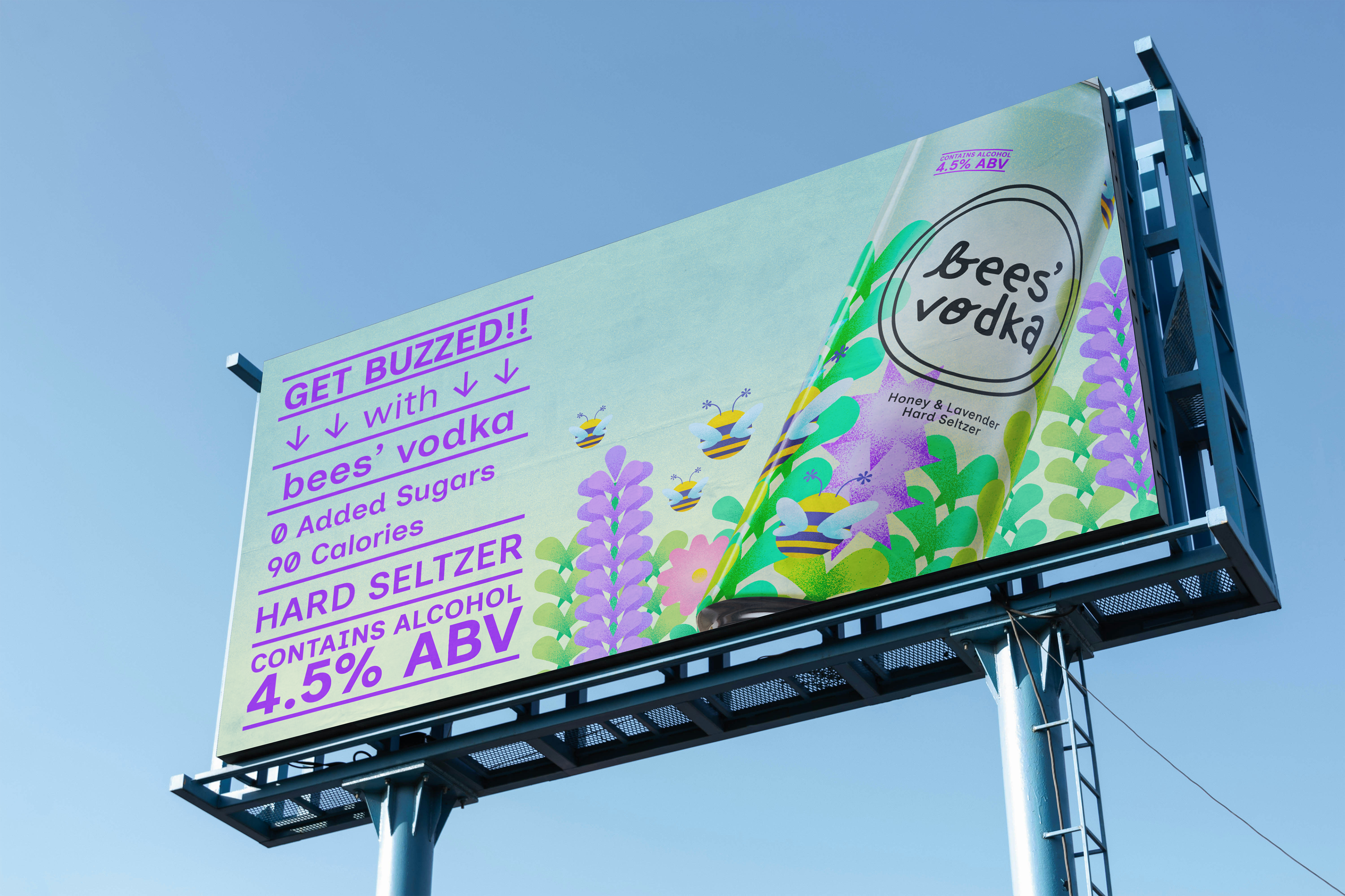
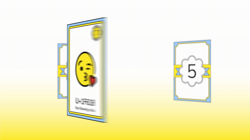
Below is the original advertisement, where you can see the first logo and some early packaging sketches. While I explored fruity flavors, I ultimately chose a floral theme, as it better complemented the overall concept of bees.
currently remaking the video to have the new logo displayed!